How To Make a Sitemap: Tips for SEO
what’s a sitemap?
There are actually three kinds of sitemaps with three completely different functions.
- A sitemap for visitors: A sitemap is a page with a list of links to all the pages on a site, usually found through a link in the website footer. This is the original.
- A sitemap for search engines: This sitemap is an xml file that tells search engines what pages to index.
- A sitemap for website planning: This sitemap is an important web design planning tool, showing pages (URLs) and the relationship between them (navigation).
The first two are easy. They are usually created automatically through a bit of programming.
The last one is hard. To do it well, you need to consider many factors at the same time: keywords, usability, and visitor psychology. Information architecture is a skill.
Sitemap tools (and a template)
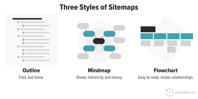
First, the format. Most website planners use a flowchart layout for creating sitemaps. But outlines are a great way to capture ideas and structure quickly. And some people love mindmaps.

Best Practices for Making Sitemaps
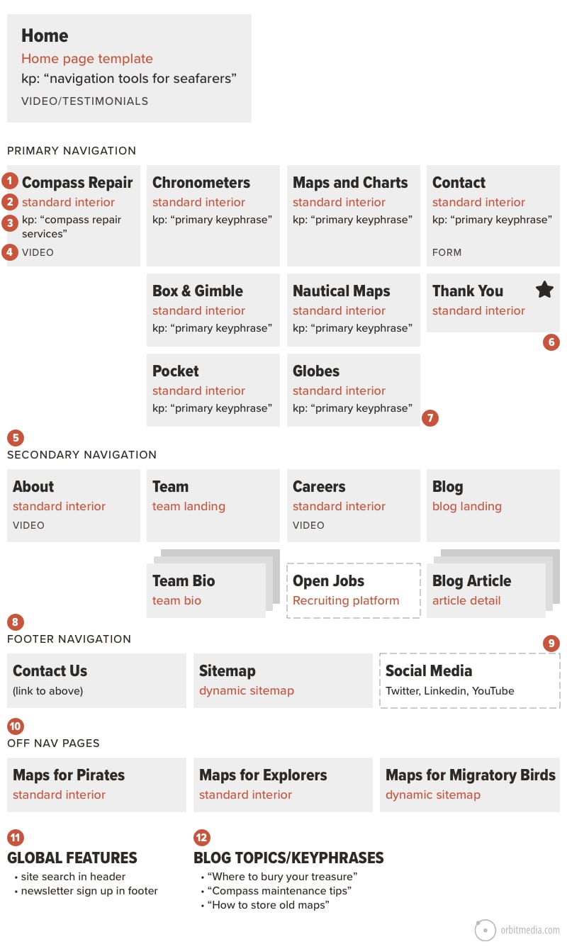
We’ve put all of our best advice for making visual sitemaps into one chart. This combines the best practices, including keywords for SEO and features for UX.
The sitemap is your first step in building a search-optimized, conversion-optimized website.

1. Page name
It’s the name of the page. Simple, right? But there’s more to it. The “page name” has several big implications.
- The label in the navigation (UX)
A vague or confusing navigation label will have a lower clickthrough rate, visible in the navigation summary in Analytics. - The header at the top of the page (SEO)
A vague or generic header may miss the opportunity to indicate relevance in search if that page is optimized to rank. A keyphrase-focused <h1> tag and title tag are both fundamental SEO best practices.
If you’re moving quickly and just capturing ideas, don’t overthink it. But in its final form, keep in mind that these page names will likely inform both the navigation menus and page content.
2. Template type
Websites are modular, built from templates. This makes them flexible. Making a new page? Pick a template and drop in your content.
It’s the number of templates (and not the number of pages) that drive the budget for design and programming. Each template has to be set up in the content management system.
The sitemap is an opportunity to specify the template types, so the designers/developers know the size and shape of the project.
The typical website project here at Orbit involves at least seven custom templates, not including the mobile/tablet versions. Here are the 10 most common website templates.
1. Home
Usually a very custom layout with special attention paid to the above-the-fold content (keeping in mind that 73% of homepage visitors don’t scroll). This template often needs to support video and may have custom graphical elements.
2. Key conversion page
This is our term for the pages that need to sell. They’re the product and service pages. The core of the site. Similar to the homepage template, this layout is designed specifically to guide the eyes through a set of prioritized messages (answers and evidence) and includes prominent calls to action.
3. Basic page
Sometimes called the “typical interior page,” this is the most flexible template type. It supports all kinds of page blocks (aka modules) and can contain all different formats for content. For most B2B websites, most pages are within this template.
4. Team main page
The people page. A highly-visual passthrough page designed to help people see the team and jump into a bio. Some websites use it twice, once for leadership and once for staff.
5. Bio detail page
The person page. These often rank for the person’s name. They compete with LinkedIn in search results, so make them good. Include lots of detail and you can use lots of schema tags. This is great for the personal SEO of each team member.
6. Blog main page
The entry into the blog? Actually, it’s more likely visitors enter from search or social and land directly on an article. But still, an important page. It’s like the cover of a magazine. If the email signup CTA is good, it’s a magnet for new subscribers.
7. Article detail page
The template for the articles usually includes the author and sharing buttons. It may also include the date, but you may want to leave this off unless your content strategy involves publishing news.
8. Product category (ecommerce)
It’s the parent to the product pages. Its job is to quickly get the visitor to go deeper into the catalog. They often are feature rich and 100% filled with dynamic content, pulled from the product database. In fact, they often have no body copy at all, making them a missed opportunity for SEO.
9. Product detail page (ecommerce)
The all-important “PDP” (that’s how ecommerce nerds shorten “product detail page”) is the workhorse of every ecommerce website.
Generic templates offered by ecommerce platforms often work well, but nothing beats a custom designed layout, specifically for that product catalog and audience.
10. Contact
The visitor is here because they want to connect (send a message or find your contact info) so reducing friction is the first job of this page.
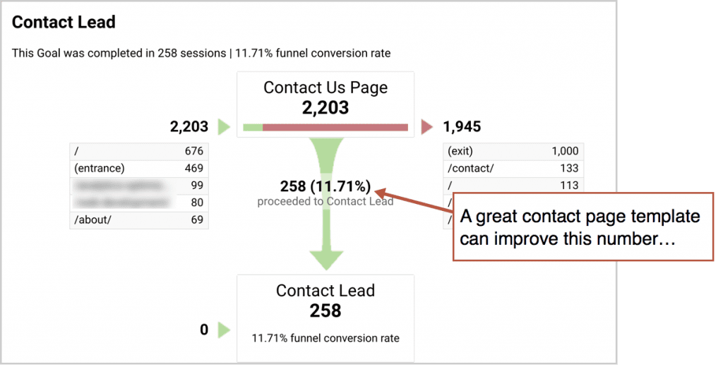
But if conversion rates are low, adding conversion-focused elements can help. Try adding faces, evidence and answers (how soon will you get back to me?) to help seal the deal. If it works, you’ll see the lift in your funnel visualization report.

Any page with custom functionality is another template. If a page offers more interactivity than basic navigation (as in, the user touches their keyboard) those interactions need to be designed and programmed. That means another template.
3. Target keyphrase
A good web design process aligns pages with keyphrases.
A great web design process lets the keyphrase research inform decisions about what pages to include.
The highest performing websites have many pages optimized for many phrases. It starts with this understanding of the basics of search optimization:
Google doesn’t rank websites. It ranks web pages.
With that in mind, here are key principles for aligning pages and phrases.
- The homepage can target the most competitive phrases.
That’s because the homepage is almost invariably the most authoritative page on any website. It has the most inbound links and therefore the greatest search ranking potential. - The service pages are optimized for commercial-intent keyphrases.
These are more valuable and competitive phrases. There may be many of these, although they don’t all have to appear in the navigation (see section 9 below). - The blog posts are optimized for information-intent keyphrases.
These are lower-intent phrases, searched for by people who are looking for answers and information, but they have no intent to get help from your business. These pages aren’t included in the main sitemap (see section 12 below). - The About page has no keyword opportunity.
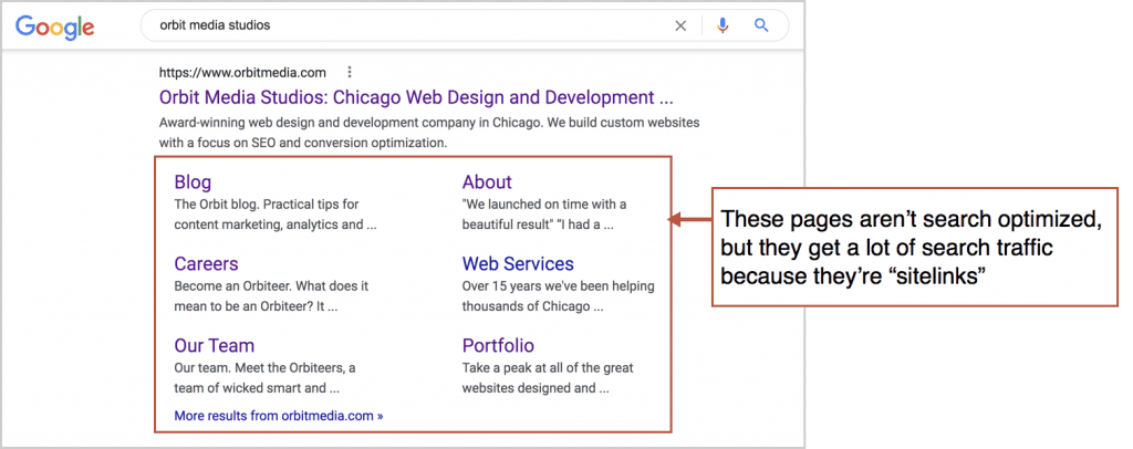
Neither do many other pages. That’s because no one is searching for them. These pages won’t have target keyphrases, although they may still be popular landing pages from search. That’s because they’re often sitelinks that appear when people search for the brand name.

Here is our guide for keyphrase research. As you pick your target phrases, add them to your sitemap.
4. UX features and formats
The sitemap is also an opportunity to plan content and features. If you know that a page will have a certain feature, function or format for content, document it right on your flowchart.
Here’s a list of common website features and where they are often found on sitemaps.
- Forms (always on the contact page)
- Maps (often on contact and location pages)
- Filters, search, email signup (often on a blog main page)
- Author, dates, comments, share buttons (often on blog detail pages)
- Calendar (often on the events page, but unnecessary unless there are a minimum of two events per month on average)
- Video/animations (often on the homepage and about pages)
- Email signup and site search (often these are global elements, see section 11 below)
There are dozens of others, from galleries to calculators, but they are far less common.
5. Separate primary from secondary navigation
Modern web design lines up navigation items in a horizontal row in the header sometimes called a nav bar. When there are too many to fit, they often get broken out into two rows, with the secondary navigation appearing higher and smaller.
Our friends at ABC/Amega are a good example…

When you make a sitemap, you’re planning the navigation. This is the time to consider the grouping of the items and their relative visual prominence. If you have more than six items, start grouping and prioritizing.
6. Thank you pages (Goals)
The goal of digital marketing is to build a bridge between traffic sources and your thank you page. Getting visitors to this page is the definition of success, at least for B2B lead generation marketing.
This page is the goal, the destination, the purpose of all of your work. So mark it with a star. ⭐
And since this page is the first interaction with your new prospect, make it shine. Here’s how to make a great thank you page.
7. Show important internal links
When you know that a page should guide visitors to another page through a link or call to action (and not just through the navigation) you should show this on the sitemap. Internal linking is important for SEO, not just usability.
Example: if the key service pages are supported by case studies, draw a line connecting them in the sitemap.
8. Plan the footer
This is a good time to plan the footer. Just put these pages in a separate section. Some will be redundant with other pages from the sitemap (the key conversion pages). But other pages will be accessible only from the footer (privacy, employee login links, social icons and the sitemap for visitors)
What else goes at the bottom? Here’s a list of everything you could ever add to a footer.
9. Show “off-site” pages
Some pages are in the navigation, but they’re actually on other websites.
These “off site” pages may be important, even critical to conversions. So let’s add them to the sitemap, but we’ll use a dotted lined box to indicate that they’re third-party tools.
Common examples include:
- Event registration pages (ex: Eventbrite)
- PPC Landing pages (ex: Unbounce)
- Login areas (ex: intranets and extranets)
- Recruiting / apply online tools (ex: CareerBuilder)
- Social media networks (ex: Faceworld, Pinstagram, Slapchat)
10. Show “off nav” pages
These are just the opposite. They aren’t in the navigation, but they’re part of the site.
Of course, not every page needs to be in the navigation. ‘Should we make this page?’ and ‘Should this be in the navigation?’ are two completely separate questions.
Lots of important pages don’t appear in the navigation menu. That’s fine as long as they have some other traffic source. Here are common examples
- SEO: It’s optimized for a relevant keyphrase
- Paid: It’s a landing page from a campaign
- Email: It’s a landing page from a promotion or welcome email series.
- Account based marketing (ABM): It’s promoted through social outreach to a targeted list.
- Sales: It’s emailed directly to prospects
These pages are important, so capture them in a section, separate from the primary and secondary navigation sections.
11. List global features
A “global element” is something that appears on every page, like the company logo and the main navigation. When an interactive feature is global, it can be documented in the sitemap.
Here are the three most common global features on marketing websites:
- Site search (often in the header)
- Email signup (often in the footer)
- Cookie consent (on the first page visited)
No need to write these in every box. Just list them at the bottom.
12. Capture blog topic ideas
Research keyphrases and you’ll find a ton of information-intent queries. These aren’t ideal for service pages, but they’re great for blog posts. Rather than scrolling right past them, capture them on the sitemap.
Add to this list any blog topics that are most relevant to sales. These posts answer the questions that prospects ask and can link directly to service pages. If you think of any topics that are priorities for the content pipeline, add them to the sitemap.
These are critical, but low-stakes decisions
That sounds like a contradiction, I know.
The sitemap is critical because the navigation labels and the flow of pages determine how people move through the site. Can they tell what you do at a glance? Is everything easy to access? A mistake can add friction, confusion and back button activity.
The sitemap is low-stakes because decisions can be changed very easily. You can always log into your content management system and change the navigation labels, move things around, add and remove pages. Digital ink is never dry.
The sitemap is a powerful planning tool, but it should be approved when confidence reaches 90%. It doesn’t have to be perfect. It’s probably not worth spending an extra week to continue to polish it.
But take time to enjoy the process. It’s fun. Information architecture combines SEO and UX, content and design.
This is one of those deliverables that true digital strategists love. ❤
THANKS FOR VISIT

